Motion
More and more websites and applications are incorporating motion into their designs and interactions. Motion can enhance the user experience by providing visual feedback, guiding attention, and making interactions feel more natural and engaging. However, I believe we should carefully consider when and how to use motion. The design principles I strive for prioritize simplicity, minimalism, and maintainability.
In this article, I will walk you through the core concepts behind building UI animations with Motion (previously known as Framer Motion), and show you four concrete examples I built to put those ideas into practice.
#Core Concepts
Before diving into the examples, it helps to understand the handful of primitives that Motion gives you. Once you internalize these, you will be able to compose almost any animation imaginable.
1. motion.* components
The foundation of every Motion animation is swapping a plain HTML element for its motion.* equivalent:
// Before
<div className="card" />

// After – now it can be animated
<motion.div className="card" />
motion.div, motion.span, motion.svg, and friends accept extra props (animate, initial, exit, transition, whileHover, whileTap, …) that describe how the element should move.
<div>
Snaps instantly
<motion.div>
Smooth transition
div on the left snaps to its new style instantly — no interpolation happens. The motion.div on the right smoothly drives between states using the browser's animation engine. Hit Trigger to compare.2. animate and initial
initial sets the element's starting state. animate describes the target state Motion will smoothly drive towards.
<motion.div
  initial={{ opacity: 0, y: 20 }}
  animate={{ opacity: 1, y: 0 }}
/>
When the component mounts, it fades in while sliding upward by 20 px. No manual useEffect or requestAnimationFrame required.
animate={{ opacity: 1, y: 0 }}
{ opacity: 0, y: 32 } to { opacity: 1, y: 0 }.3. transition
transition controls how the animation plays — duration, easing curve, delay, and type. Motion supports three physics models:
| Type | Behaviour |
|---|---|
tween | Classic CSS-like easing (linear, easeIn, easeOut, easeInOut) |
spring | Physics-based spring with stiffness, damping, and mass |
stiff spring | High stiffness, low damping — overshoots and bounces back |
// Smooth CSS-style
transition={{ type: "tween", duration: 0.6, ease: "easeInOut" }}

// Natural spring
transition={{ type: "spring", stiffness: 300, damping: 20 }}

// Bouncy spring
transition={{ type: "spring", stiffness: 600, damping: 10 }}
4. layout prop
Adding layout to a motion.* element tells Motion to automatically animate whenever its size or position changes in the DOM. This is the secret ingredient behind smooth accordion expansions, list reordering, and collapsing cards — you simply change state and Motion handles the interpolation.
<motion.div layout animate={{ height: isOpen ? 96 : 48 }}>
  {isOpen && <ExpandedContent />}
</motion.div>
without layout
with layout
Click a card to expand it
layout, siblings snap to their new position instantly. Withlayout, everything glides into place — no manual height calculation needed.5. AnimatePresence and exit
React removes elements from the DOM instantly. AnimatePresence wraps a group of conditionally rendered elements and gives them a chance to play an exit animation before they are removed.
<AnimatePresence mode="wait">
  {isVisible && (
    <motion.div
      key="my-element"
      initial={{ opacity: 0, scale: 0.8 }}
      animate={{ opacity: 1, scale: 1 }}
      exit={{ opacity: 0, scale: 0.8 }}
    />
  )}
</AnimatePresence>
The mode="wait" option ensures the outgoing element finishes its exit animation before the incoming one starts — preventing two elements from overlapping.
mount & unmount with exit animation
tab swap with mode="wait"
exit scale animation. The bottom section uses mode="wait" for a directional tab swap — the outgoing tab slides out before the incoming one slides in.6. Gesture props
Motion exposes ergonomic props for common user interactions:
<motion.button
  whileHover={{ scale: 1.08, y: -4 }}
  whileTap={{ scale: 0.92, y: 2 }}
  transition={{ type: "spring", stiffness: 400, damping: 17 }}
/>
These feel far more alive than a CSS transition: transform 0.2s because they respond in real time to the user's pointer speed.
whileHover
whileTap
both
whileHover and whileTap compose together. The spring transition makes the scale feel responsive to the speed of your interaction, not just the state change.The Mental Model
Think of a Motion animation as three questions:
- Where does it start? →
initial - Where does it end up? →
animate - How does it get there? →
transition
Everything else (exit, layout, whileHover, …) is just layering more answers on top of those three questions.
#Dynamic Island
Apple's Dynamic Island on iPhone 14 Pro is a brilliant example of purposeful motion — a hardware notch that transforms into context-aware UI. The demo below recreates that concept: a pill-shaped container that expands to show a silent / ring notification, then collapses back.
animate, while AnimatePresence mode="wait" crossfades between three content states. The looping bell shake is driven by a repeat: Infinity rotation sequence.How it works
The key technique here is animating width and height directly on a motion.div combined with layout:
<motion.div
  layout
  animate={{
    width: expansionState === "collapsed" ? 120 : 200,
    height: expansionState === "collapsed" ? 36 : 50,
  }}
  transition={{ duration: 0.4, ease: "easeInOut" }}
  whileHover={{ scale: 1.05 }}
  whileTap={{ scale: 0.98 }}
>
Inside the pill, AnimatePresence mode="wait" swaps between three content views (collapsed, expanded, controls) with crossfade transitions. Each view is keyed so React and Motion can track which element is entering and which is leaving.
The bell icon in the ring state uses a looping rotate animation to simulate ringing:
animate={{
  rotate: [-5, 5, -5, 5, 0],
}}
transition={{
  duration: 0.4,
  repeat: Infinity,
  repeatDelay: 0.3,
}}
Concept to remember: Combine layout + animate size changes + AnimatePresence for any component that morphs its shape in response to state.
#Notifications
The notification stack collapses multiple cards into a "fanned" pile when hidden, then fans out into a readable list when expanded — a pattern used by iOS, macOS, and many notification centre UIs.
Notifications
MyUSC1 ·
just now
USCMyUSC2 ·
4m ago
USCMyUSC3 ·
6m ago
USCy offset, smaller scaleX, and lower opacity when collapsed — creating a stacked depth illusion with a single boolean. Tap any card or the Collapse button to toggle.How it works
Each notification card is a motion.div with an independent y (vertical offset) and optional scaleX / opacity target driven by the show boolean:
// Second card — partially visible behind the first
<motion.div
  animate={{
    y: show ? 0 : -100,
    scaleX: show ? 1 : 0.95,
    opacity: show ? 1 : 0.75,
  }}
  transition={{ type: "tween", duration: 0.4 }}
/>

// Third card — deeper in the stack
<motion.div
  animate={{
    y: show ? 0 : -200,
    scaleX: show ? 1 : 0.9,
    opacity: show ? 1 : 0.5,
  }}
  transition={{ type: "tween", duration: 0.6 }}
/>
By giving each card a progressively larger y offset and a slightly longer duration, the cards collapse into a satisfying stacked silhouette at different speeds — the bottom card "catches up" last, which feels natural.
Concept to remember: Stagger depth effects by varying y, scaleX, opacity, and duration across sibling elements driven by the same boolean. No staggerChildren needed for simple cases.
#Paginations
A custom animated pagination indicator that tracks which carousel slide is active. The active dot expands into a label pill while the inactive dots shrink — a pattern popularised by the Apple AirPods Pro feature carousel.
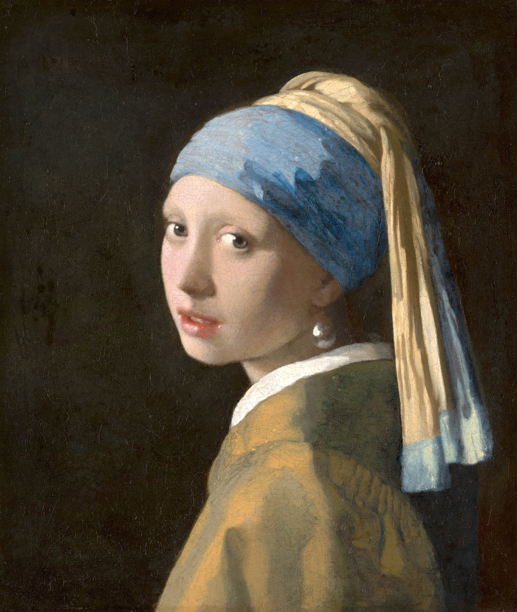
Girl with a Pearl Earring
Johannes Vermeer, 1665

The Starry Night
Vincent van Gogh, 1889

The Great Wave
Katsushika Hokusai, 1831
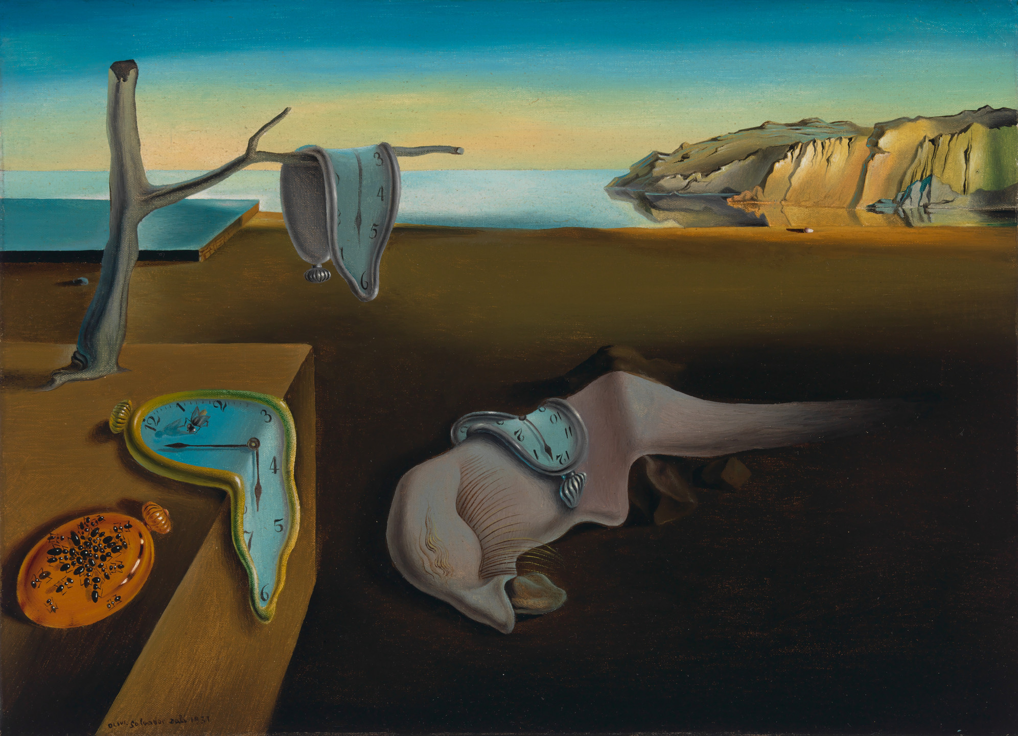
The Persistence of Memory
Salvador Dalí, 1931
- Girl with a Pearl Earring
type: "spring" scale and reveals its text label. All inactive dots shrink and lose their text. Dragging the carousel or clicking a dot both update the same current state.How it works
The indicator is a list of motion.li elements. Each item's scale is driven by whether its index matches current:
<motion.li
  animate={{ scale: current === index ? 1 : 0.8 }}
  transition={{
    type: "spring",
    stiffness: 300,
    damping: 20,
  }}
  className={current === index
    ? "min-w-fit px-3 py-2 bg-white rounded-full text-xs shadow-md"
    : "w-3 h-3 bg-gray-300 rounded-full"}
  onClick={() => api?.scrollTo(index)}
>
  {current === index ? text : ""}
</motion.li>
The carousel itself uses shadcn/ui's Carousel under the hood, and the CarouselApi event "select" keeps current in sync:
api.on("select", () => {
  setCurrent(api.selectedScrollSnap())
})
Concept to remember: Spring transitions on scale are perfect for indicator dots — they feel bouncy and alive without being distracting. Always use a type: "spring" transition for indicators and icon state changes.
#Payment
A multi-step payment flow where the form card pops in from nothing, the button label morphs through states ("Make Payment" → "Send" → "Sent"), and a checkmark SVG path draws itself on completion.
scale: 0 via AnimatePresence. On confirmation, pathLength animates from 0 → 1 on the SVG checkmark path, producing a "draw-on" effect without any canvas or CSS tricks.How it works
Step 1 — Modal entrance: AnimatePresence wraps the form, which scales in from scale: 0 to scale: 1:
<AnimatePresence initial={true}>
  {showModal && (
    <motion.div
      key="box"
      initial={{ opacity: 0, scale: 0 }}
      animate={{ opacity: 1, scale: 1 }}
      exit={{ opacity: 0, scale: 0 }}
      transition={{ duration: 0.3, type: "tween" }}
    />
  )}
</AnimatePresence>
Step 2 — SVG path drawing: This is the most visually striking trick. Motion can animate pathLength on an SVG <path>, which makes it look like the path is being drawn in real time:
<motion.svg
  initial={{ pathLength: 0 }}
  animate={{ pathLength: 1 }}
  exit={{ pathLength: 0 }}
  transition={{ duration: 0.5 }}
>
  <motion.path d="M20 6L9 17l-5-5" />
</motion.svg>
pathLength goes from 0 (invisible) to 1 (fully drawn). Combined with AnimatePresence, the checkmark draws itself when the payment is confirmed and undraws itself when reset.
Concept to remember: pathLength animation on motion.path is one of Motion's hidden gems. It works on any SVG path and creates a "draw-on" effect that feels premium without any canvas or CSS tricks.
#Summary
Here is a quick reference of the Motion concepts used across all examples:
| Concept | Used in |
|---|---|
animate + layout (size morphing) | Dynamic Island |
AnimatePresence mode="wait" (content swap) | Dynamic Island, Payment |
whileHover / whileTap (gesture feedback) | Dynamic Island, Gesture demo |
Staggered y + opacity offsets | Notifications |
type: "spring" on scale | Paginations, Transition demo |
pathLength SVG drawing | Payment |
initial + animate (entrance) | Animate demo, all components |
The biggest shift when adopting Motion is moving from CSS-driven to state-driven animations. Instead of writing keyframes or managing class toggles, you describe the desired end state in animate, and Motion figures out how to get there. That mental model — what rather than how — is what makes Motion so ergonomic for building production UI.
Inspired by ui.lndev.me and the Motion documentation.